Bold carpet colours? YES! Colourful ways to make things happen in the office
Colour matters - it can separate zones, add style, but also become a showpiece for the interior. Thus, briefly about colourful ways to make things happen in the office.
Finding the perfect premises for your company's headquarters is certainly a great start, but after that comes a lot of questions about how to furnish the space so that you can work effectively. So before we start renting or buying furniture and other equipment, let's consider how to divide up the space we have so that we can use it optimally.
In recent years, Activity Based Working has also been gaining popularity in Polish offices.
This trend, in addition to many changes in the ways in which the company and its employees are managed - provides for the presence in the office not only of individual workstations, but also zones designed for the performance of various tasks.
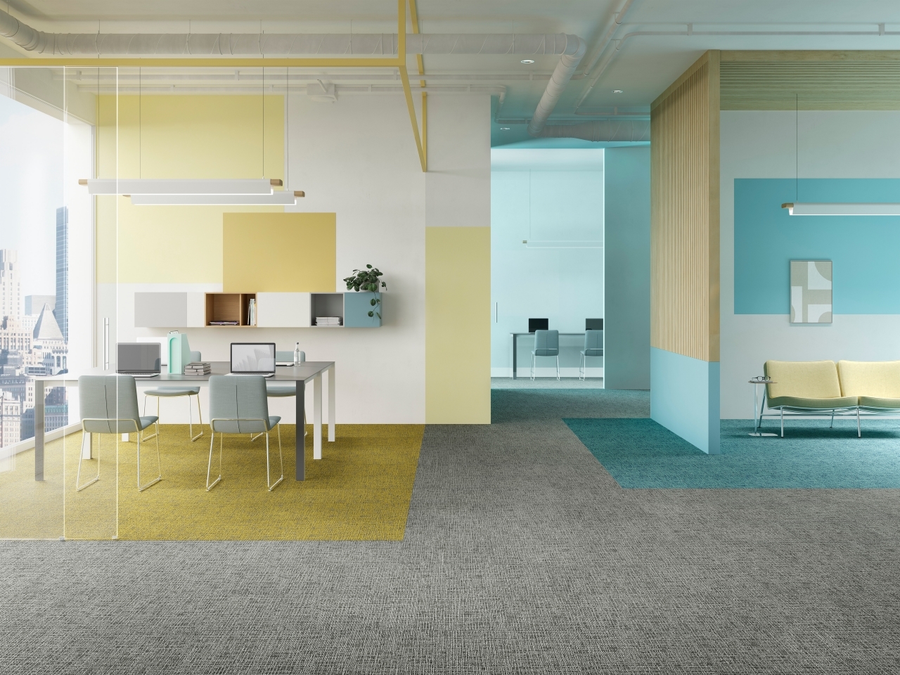
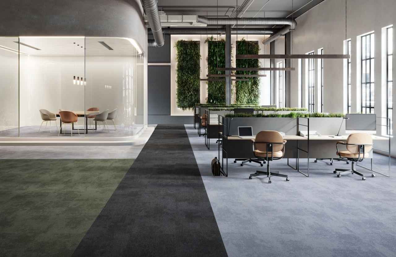
Accordingly, zones are being set aside for both individual and team work. The former is based on separate desks, usually separated by panels from other zones and other desks, so that it is possible to work here in silence and concentration, while the latter is based on large tables that allow the exchange of ideas and discussions between several people.
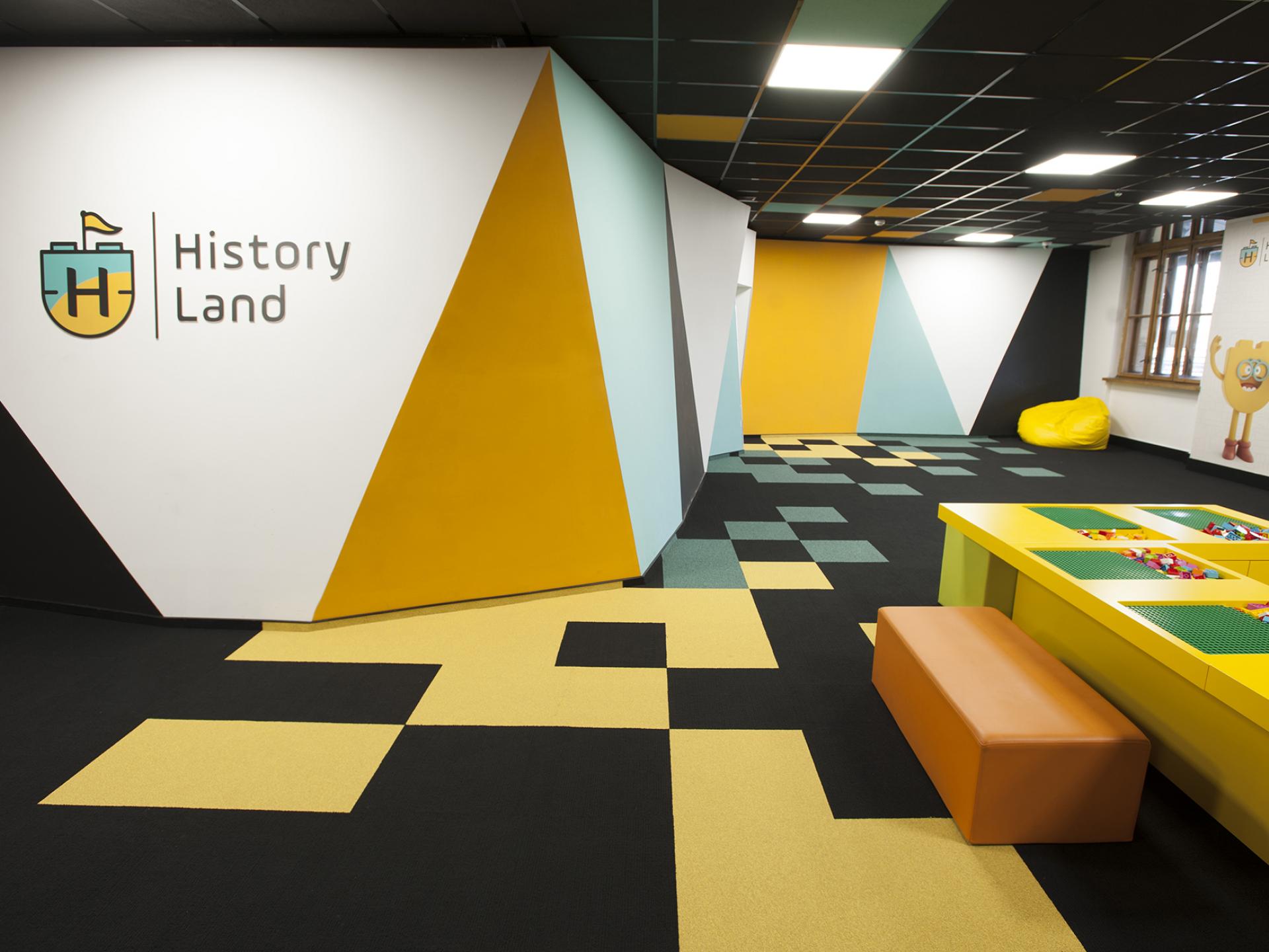
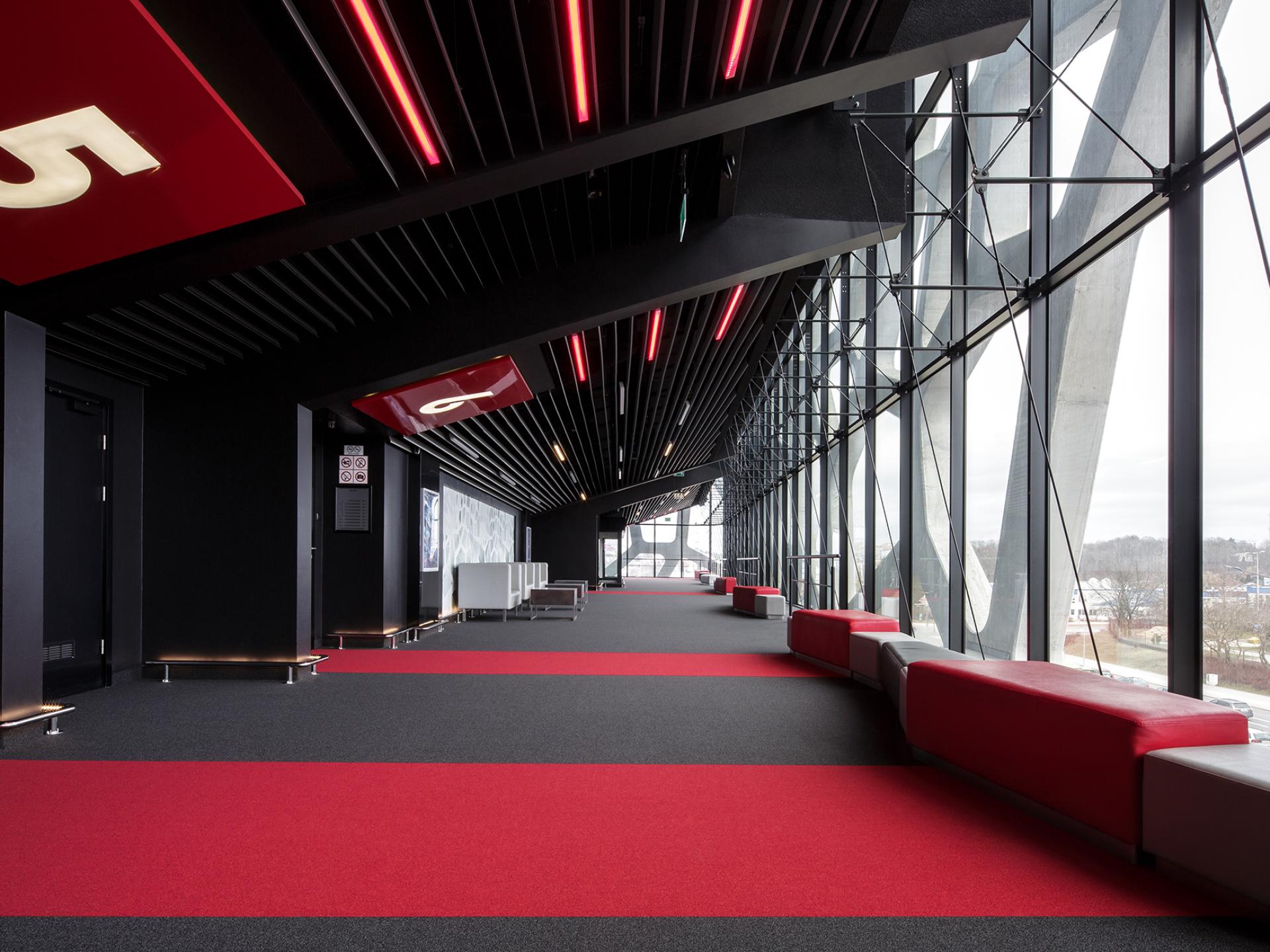
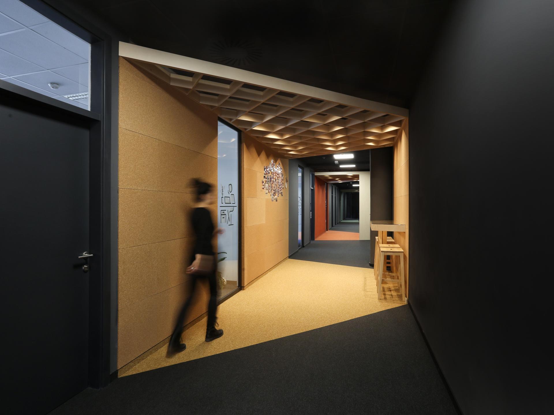
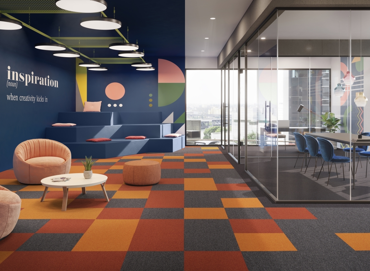
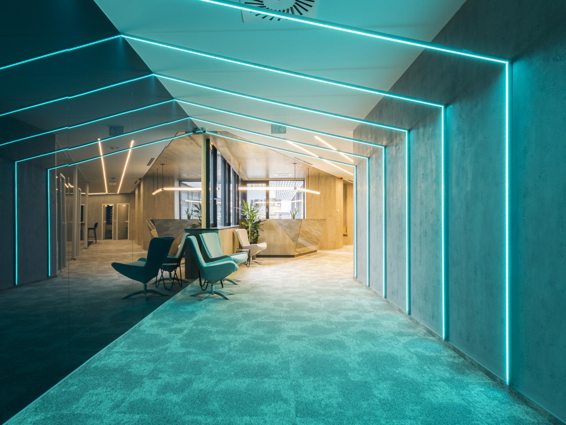
Carpets are also a very helpful element in separating zones in the office. With the use of different types and colours, it is possible to quiet down office zones, relaxation zones, while enlivening areas such as creative work rooms and conference rooms. By using colours, we can mark out circulation paths that will make it easier to get to particular areas.
By combining several colours of different tile shapes, we can give an extremely original character to the interior, personalising the interior of our office.
In addition, with the colours we can emphasise the character of the company or underline the company's attachment to its own logo.
Despite the leading trend in offices towards earthy colours, architects are not afraid to use vibrant colours.
The Pantone Institute, which has announced a leading colour every year for the past 20 years, has chosen Living Coral for 2019, Tranquil Dawn for 2020 and Ultimate Grey and Illuminating Yellow for 2021. "It's a combination that alludes to the resilience, optimism, hope and positivity we so desperately need as we reset, renew, reinvent and reinvent ourselves," - explains this year's selection by Laurie Pressman, vice president of the Pantone Color Institute.
So let's not be afraid to use such colours in carpets, just to show that we are on top of current trends.